BI Tools | Context is Key
Over the years I’ve been asked to review and assess clients’ internally developed business intelligence (BI) tools and platforms on more than a few occasions. Some of them are great, and some of them could use some work.
As an example of the latter, a few years ago, I was working on one of these business intelligence projects for a client. The request for the analyst had been a simple dashboard that would show the annual rent for each asset type. The analyst did as requested, but the real estate team was not satisfied with the results.
Why? There was no context.
- Were the rent totals high or low?
- How many assets are there in each category?
- How much square footage is in each category?
- How did these counts and totals compare to last year at the same time?
- Are we doing great or horrible against the market rates for these asset types?
They said that the report did not provide the context they needed to make informed decisions. Whenever BI tools and dashboards are in development, you need to consider the best ways to provide context. If you do that, the end users will be able to make informed business decisions based on the insights gained from the data.
Assuming we have the data available, what tools are at our disposal to provide that context? Enter business intelligence (BI).

What are BI Tools in CRE and How Do You Utilize Them?
Business Intelligence (BI) tools in the context of CRE are software applications and platforms designed to collect, visualize, and analyze data related to real estate properties and transactions. Here’s how to use BI tools in Commercial Real Estate:
Data Aggregation and Analysis
| Data Aggregation | Business intelligence platforms gather data from various sources, including property databases, market reports, financial statements, and tenant information. They may also collect real time data from external sources like demographic information, economic indicators, and competitive analysis. This integration allows users to combine data discovery from multiple properties or portfolios for comprehensive analysis. |
| Data Analysis | BI tools provide powerful predictive analytical capabilities, including data modeling, forecasting, and statistical analysis. Users can perform financial modeling, risk assessment, and market trend analysis to evaluate property performance and investment potential. BI tools assist in calculating and evaluating return on investment (ROI) and performing sensitivity analysis. |
Reporting And Tracking
| Reporting and Visualization | BI software offers reporting and dashboard features that allow users to create custom reports and visual data. These reports can include charts, graphs, maps, and tables to present data in a meaningful way for decision-makers. |
| Performance Tracking | Commercial real estate professionals can use BI tools to track key performance indicators (KPIs) such as occupancy rates, rental income, and property expenses. This helps in monitoring the health of individual properties and portfolios and provide a competitive advantage for business operations. |
Research, Management, and Support
| Market Research | BI tools provide access to market data, helping users identify market trends, demand patterns, and competitive landscapes. Real estate professionals can use this data warehouse to make informed investment decisions. |
| Portfolio Management | BI tools assist in portfolio optimization by analyzing the performance of multiple properties or assets within a portfolio. Users can identify underperforming assets, assess risk exposure, and make strategic decisions about buying, selling, or renovating properties. |
| Lease Management | BI tools can help manage lease agreements, track lease expirations, and analyze lease performance. Users can identify opportunities for lease renegotiation or expansion. |
| Risk Assessment | BI tools enable users to assess risk factors such as interest rate fluctuations, market volatility, and economic conditions. This information helps in making informed decisions regarding financing and investment strategies. BI tools assist in evaluating potential real estate investments by conducting financial modeling, calculating return on investment (ROI), and performing sensitivity analysis. |
| Decision Support | Ultimately, BI tools serve as decision support systems, providing real-time insights and data-driven recommendations for commercial real estate professionals. |
One of the most important aspects of BI is data visualization. This involves presenting data in a visual format such as graphs, charts, maps, and tables. Another critical component is how the user interacts with the visualizations.
The Building Blocks of Context
Let’s explore the different types of graphs and display options available in BI. By the end of this blog, you’ll know:
- when to use each of them to provide the context
- how to plan an intuitive and powerful interface for end users
1. Bar Graphs
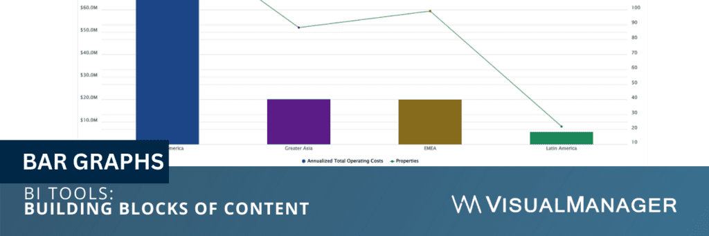
BI commonly utilizes bar graphs as one of the most prevalent types of graphs. They are used to compare data across different categories. For example, a bar graph compares the total square footage for different business units or regions. Bar graphs are easy to read and understand, and they show trends over time.
Some people prefer pie charts to bar graphs, however, with a bar graph, you can add a second metric which is why we usually use them. Frequently we show the number of properties on the second (right-hand) y-axis (vertical) while showing the primary metric whether it be total area, total cost, people, seats, or any of the calculated unit metrics on the primary (left-hand) y-axis.
This method effectively communicates more meaningful information in the same graph. For example, if we were showing cost per square foot by business unit, one may appear much higher than the others, setting off an alarm for the people viewing the information. However, suppose that the business unit only had two locations and they were both in “high-rent” areas out of necessity.
Context is important, and the additional metrics shown in the proper way provide that context.
2. Line Graphs
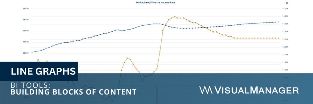
Line graphs are used to show trends over time. For example, a line graph shows how the cost per square foot or people per seat has changed over the course of the past year. Line graphs are easy to read and understand, and they identify patterns and trends.
Most BI applications allow you to overlay an average of your data set, or separately a target, against your line graph display as well. Both of these overlays allow the end user to more easily identify the best or more poor performers or those with an opportunity for improvement.
3. Pie Charts
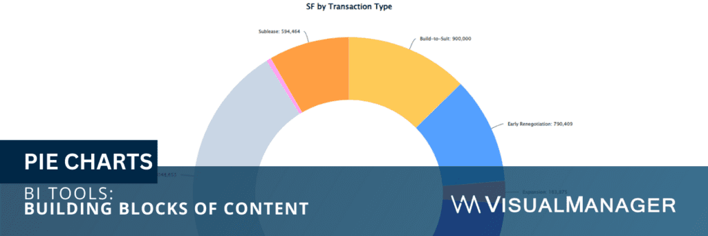
Pie charts are used to show the proportion of different categories in a dataset. These are best when you do not have too many categories (generally less than 10) and are only focusing on a single metric.
For example, a pie chart shows the percentage of leased versus owned facilities.
Pie charts are known for their ease of reading and understanding, and they emphasize the most significant categories within a dataset.
Some BI platforms allow you to add a second layer to your pie chart (some call these sunburst charts), essentially having a segmented doughnut surrounding a pie chart. While these look pretty cool, end users often find them confusing to interpret. If any of your visualizations are confusing to your intended audience, change them.
4. Scatter Plots
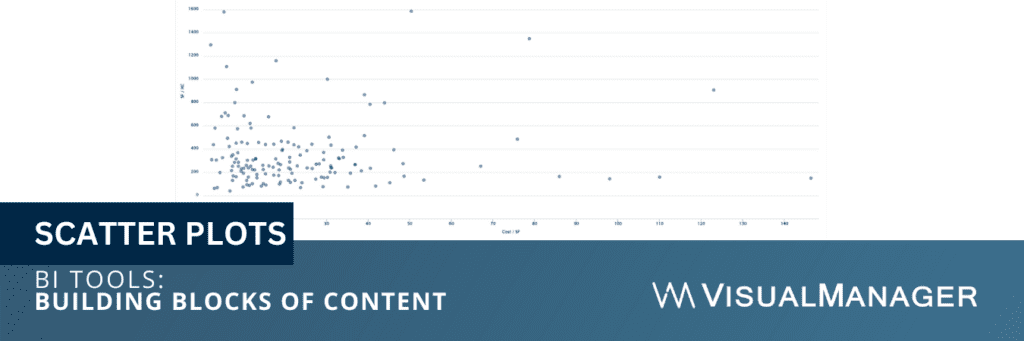
Scatter plots are used to show the relationship between two variables. For example, a scatter plot shows the relationship between cost per square foot and people per seat. Scatter plots are useful for identifying patterns and outliers in data.
In this case, you may more easily identify locations that could see the most benefit from a restack to increase capacity or downsize / relocation to shed unneeded space.
5. Maps
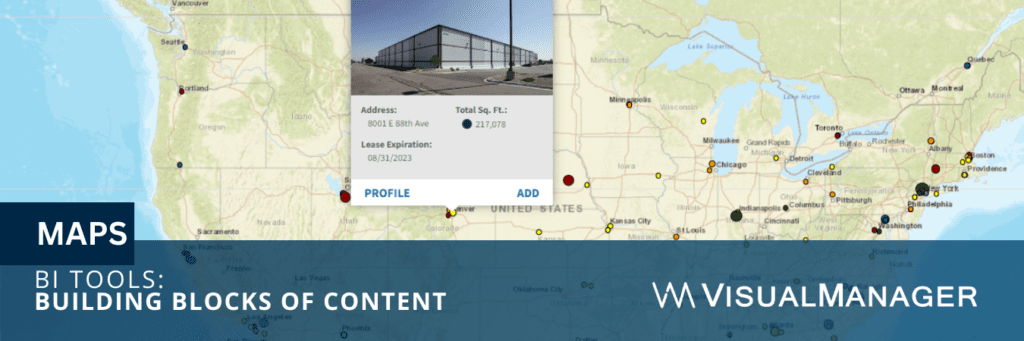
Maps are a critical component of any commercial real estate business intelligence implementation. Decision-makers need the context of “where” all the assets are to plan best to support both current and projected business needs.
Maps identify properties in a portfolio with simple dots. Most systems allow you to size those dots by your chosen metric as well, such as square footage or total annual cost. Color coding is also useful to identify key dimensions whether it be by business unit, asset type, or upcoming expiration groups.
In addition to “point” maps described above, heat maps and choropleth maps can provide a means to overlay even more information against a portfolio’s point map of locations. Heat maps are more “continuous” in nature, while choropleth maps are a set geographic level, such as country, state, county, zip, or census tract.
6. Tables
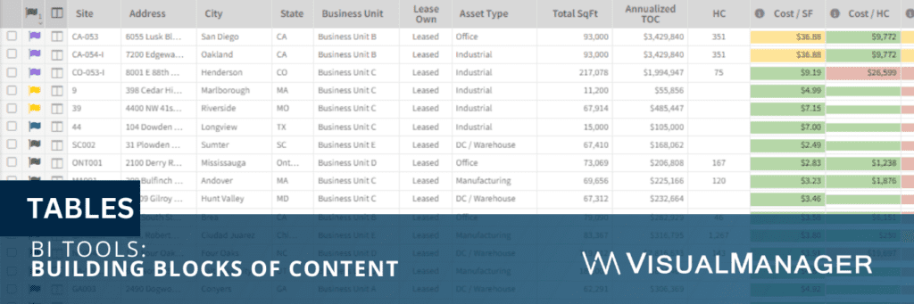
Tables are used to present the details from the other display types. They are useful for presenting large amounts of data in a structured format. Tables are easy to read and understand, and they highlight the most important data points.
One of our favorite use cases for data tables in BI is to provide the line item details once a user has filtered down to a subset of interest. These locations could be outliers for certain unit metrics such as the most efficient or least efficient locations, or those with suspect data quality issues.
In addition to the above six visualization types, there are many more, such as:
- Sankey
- Funnel
- Bullet
- Pivot
- Radar
- Waterfall
- Word Clouds
- Histogram
- Box Plots
For each of these and the above, you need to sit back and consider, “Is this the best BI tool for my audience?” You could create a very complicated super cool multi-variable Sankey chart that tells you all the things you’d want to know from the underlying data.
It may be great from a data scientist’s perspective, and that’s awesome if those are the folks using that visualization. However, if they are less technical, it is often better to use multiple more basic visualizations that can convey the same context.
Dashboard Assembly for Context
Now that we have identified the building blocks, how do we pull it together in a way that succinctly tells the story the end users need to answer their questions?
The first step is understanding the goals of each of the audience.
- What type of questions are they asking on a regular basis?
- What situations or circumstances should trigger an alert?
Getting this information from the end users will allow you to create a list of dashboards. Some common examples in commercial real estate would include: portfolio overview, business unit overview, asset type overview, lease expirations, utilization and capacity, active transactions, completed transactions, active projects, completed projects, rent forecasting, and the list goes on.
Within each of the areas, thought must be given to the best “building blocks” to assemble to effectively tell the story for that dashboard.
Minimum Overview Guidelines
Most portfolio overviews, in my opinion, should at a minimum include:
- a map
- a bar or pie chart showing the total square footage
- a bar or pie chart showing the total cost
- a summary table with a few other “primary” metrics such as:
- headcount
- seats
- cost per square foot
- active transactions
- active projects
Ultimately, the charts and summary tables are set up at the dimension of most importance to the audience whether it be region, business unit, asset type, or some other designation. The maps and graphs are color-coded the same so end users can more intuitively interpret the visualizations.
Drill-Down for Additional Context
Viewing a portfolio dashboard without filters (showing all properties in the case of commercial real estate for example) is powerful. It should evoke questions from the end users. Your dashboard should be set up to anticipate and answer those questions.
Enter filters and drill-down dimensions.
Many platforms are set up where the end user can click on a bar or piece of the pie chart and have the entire dashboard drill down to reflect that selection. The designer needs to understand what that next dimension should be.
In the area of geography, it is pretty straightforward.
- If region were the primary dimension (shown when no filters were applied) if a single region were selected, the next logical dimension would be country, then state/province, then city, then address
- If “business unit” were the primary dimension, the drill-down path may go to leased or owned, then to asset type, then to address. This all depends on the quantities we are dealing with as well.
As a matter of design, we believe in starting with everything. Then, logically filtering to smaller groups, then showing the line-item details of those smaller groups. Then showing the minutia for a single selected property if the end users wish to get to that level of detail.
Conclusion
In conclusion, data visualization is an important aspect of business intelligence and is critical in providing the proper context. There are many different types of graphs and display options available. The selection of a graph or display option depends on the nature of the data being presented and the message that needs to be conveyed.
By choosing the correct BI tools, businesses can present their data in a clear and concise manner, and make informed decisions based on the insights gained from the data.